The Dynamic Grid Lightning Web Component (LWC) provides a flexible solution to display data dynamically in a card format. The card’s layout can be configured through HTML templates. The LWC is powered through a robust framework to allow records from multiple data sources to be displayed. The data from each data source is displayed using a template that allows rich text content.
Dynamic Grid is also supported with the new Dynamic Search and Dynamic Filter capability to enhance the overall flexibility of the Dynamic Grid.
Configuration Options
Learn more about Experience Builder here.
From the components list, select the Dynamic Grid component and drag it onto the site page.
Click within the Dynamic Grid component on the page to bring up the Property editor.
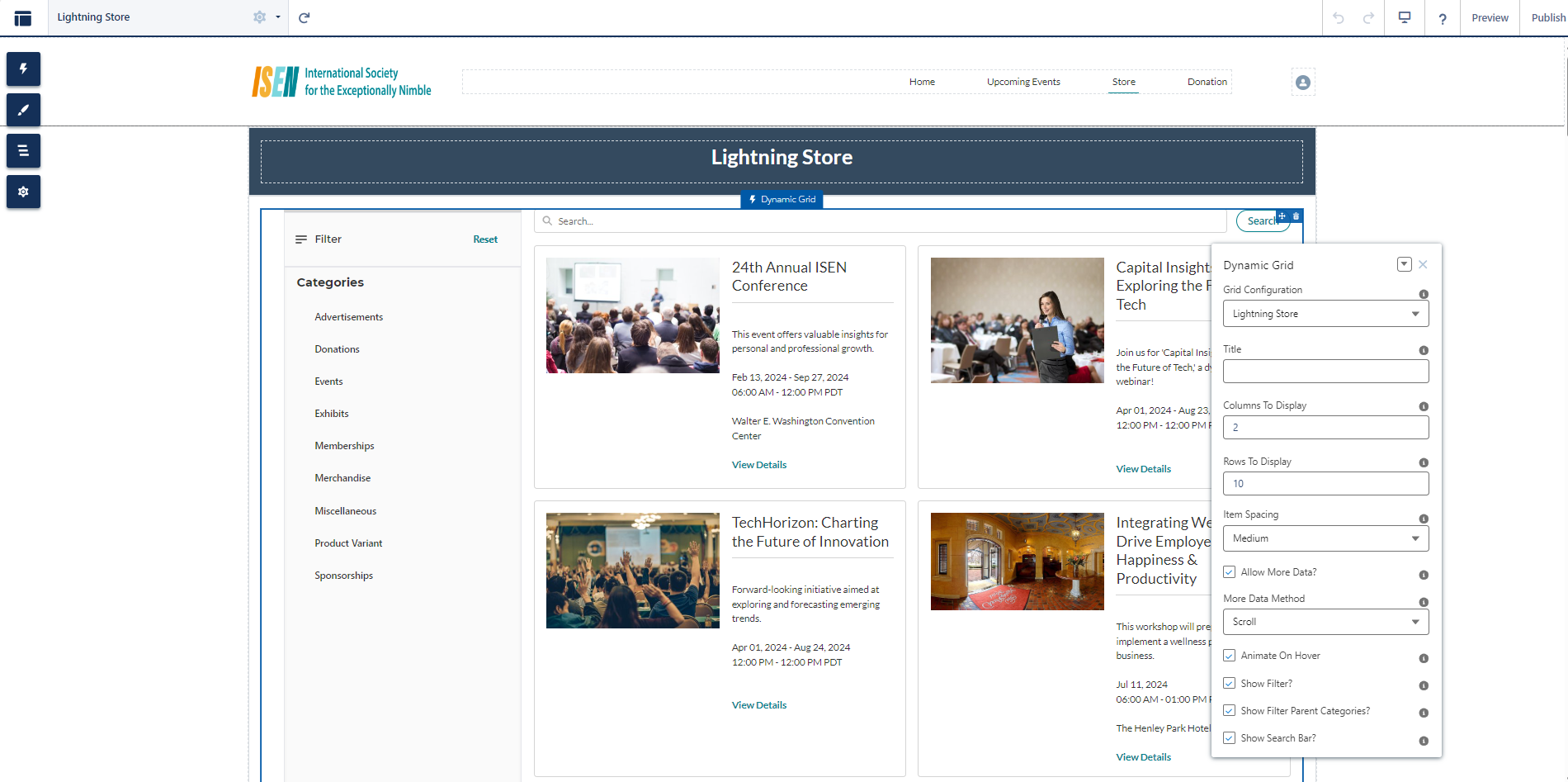
Figure 1. Dynamic Grid LWC with configuration properties
|
Property |
Details |
|---|---|
|
Dynamic Grid |
Select a value from the drop-down to display the content. Note: Additional Data Sources can be created based on the data to be displayed within the grid. |
|
Title |
Enter the text that you want to be displayed as the heading at the top. |
|
Columns to Display |
Enter the numeric value (for example: 3). This field enables users to determine the maximum number of vertical columns to display. |
|
Rows to Display |
Enter the numeric value (for example: 10). This field enables users to determine the number of horizontal rows to display on the initial load. |
|
Item Spacing |
Select spacing preference between cards. Options are None, Small, Medium, and Large |
|
Allow More Data? |
When checked additional data will be displayed. When unchecked, the maximum number of records displayed will be the number set in ‘Columns to Display’ times the number set in ‘Rows to Display’. |
|
More Data Method |
Applicable when the 'Allow More Data?' property is checked. When checked, select the method for displaying additional records: Scroll: Loads additional data with mouse scroll. Button: Loads additional data upon clicking on the “Load More” button. |
|
Animate on Hover |
When checked the card zooms in on mouse hover. |
|
Show Filter? |
If the checkbox is checked, then members can view the Filter option on the new Lightning Store of Experience Cloud Community Hub. |
|
Show Filter Parent Categories? |
If the checkbox is checked, Parent Categories will be part of the Filter on the new Lightning Store of Experience Cloud Community Hub. As an example: If the Association is selling Merchandise, Donations, and Events on the Lightning Store then the Parent Categories would be Donation, Events, and Merchandise. |
|
Show Search Bar? |
If the checkbox is checked, members can view the Search Bar on top of the grid layout on the new Lightning Store of Experience Cloud Community Hub. |
|
Hide Dynamic Grid If No Results |
Check this box if you prefer the component to be invisible when the SOQL query returns zero records. |
|
No Records Found Display |
Enter the custom text you want users to see when the grid is empty. If left blank, the standard system message will display. |
Example
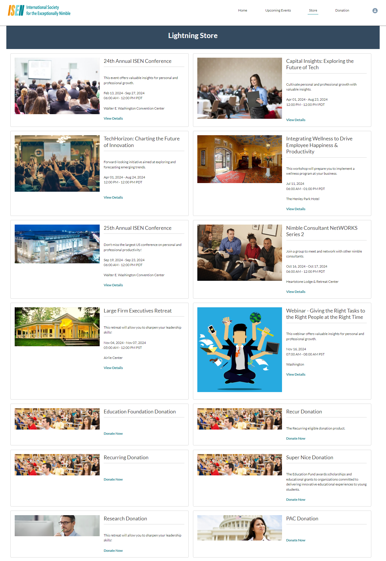
Figure 2. Dynamic Grid page showing different product types on Experience Cloud Community Hub
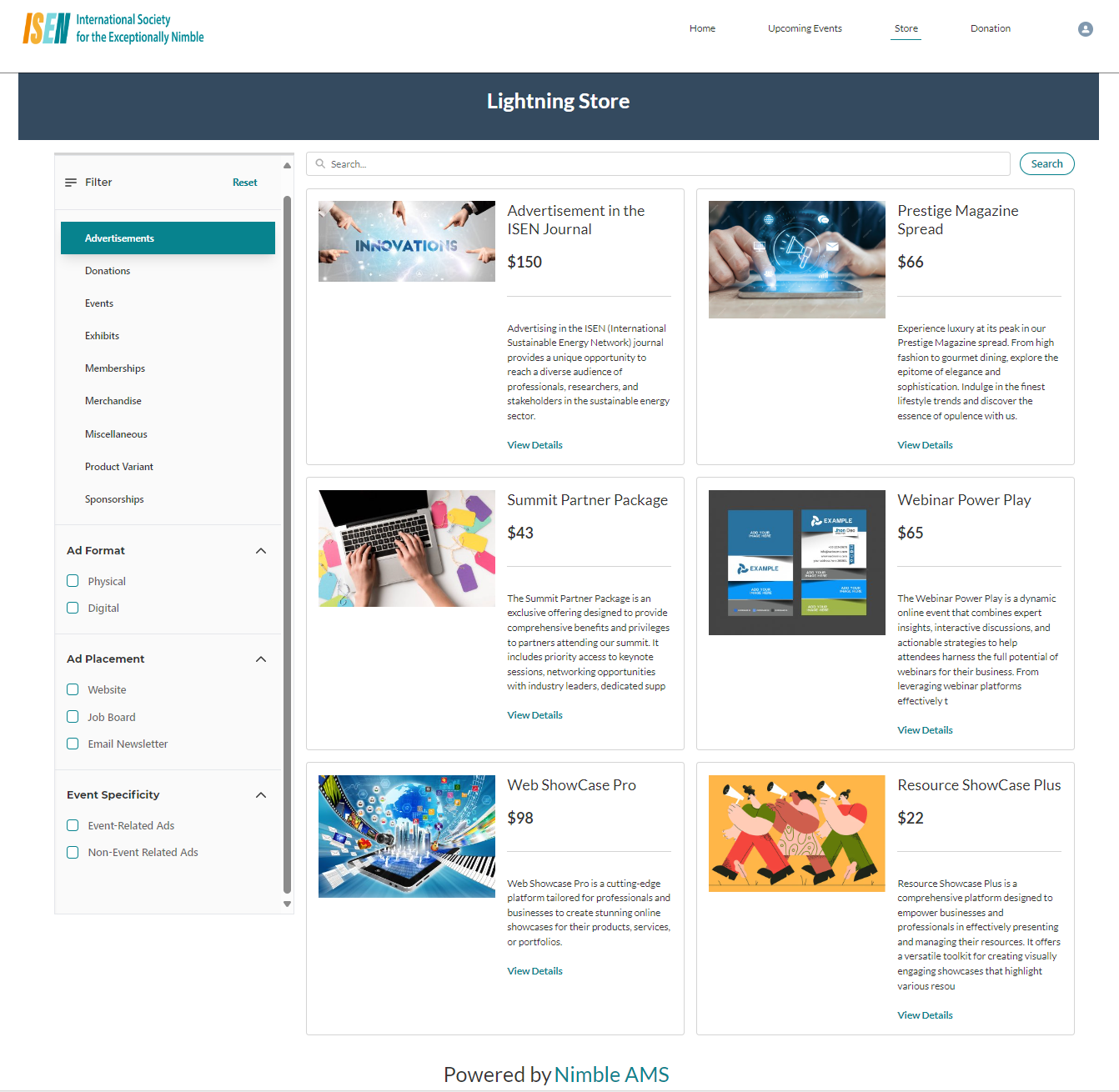
Figure 2: This screenshot shows the Dynamic Search Bar and Filter on the new Lightning Store of Experience Cloud Community Hub
Benefits
-
Flexibility and Customizability: The Dynamic Grid LWC ensures that admins can easily configure the properties to suit their specific requirements, and its customizability extends to letting associations personalize the kind of data they want to present in Experience Cloud Community Hub.
-
Enhanced Data visualization: The Dynamic Grid LWC not only provides the option to present data in an informative way but also a visually compelling format ensuring that your members have an amazing experience as they navigate through Experience Cloud Community Hub.
-
Member Convenience: Quickly find desired products by narrowing down search results based on specific criteria leading to a more efficient and enjoyable shopping experience.
-
Improved Conversion Rates: Finding the products you need with ease, increases the likelihood of purchase. This in turn increases the likelihood of conversions and sales.
-
Configurability: Tailor the Search Bar & Filter through the point-and-click tools that align with your association’s business needs.
Use other LWCs from the Component list to create an impactful page for your constituents. For eg. use the ‘Rich Content Editor’ to add supporting information about the donation and the specific cause your constituents would be supporting. For detailed steps on how to access and use Experience Builder, visit Experience Builder Overview (salesforce.com)
LWC Dynamic Grid can be used to display products for the New and Improved Lightning Store.
Get Started Today
Reach out to your Customer Success Manager representative to get started!
Related
Lightning Web Components Library